The Eclectic Inklings of Henrik Drescher
In the
early-to-mid 1980s I was an undergraduate student in art at Rutgers University
and had a keen interest in contemporary illustration. My family subscribed to the New York
Times ever since I could remember, so we spent many hours gazing at Al
Hirschfeld’s work in the Arts & Leisure section, hunting for
Ninas. But as an undergrad, I began to
take more notice of the illustrations that appeared in the Op-Ed and Book
Review sections of the Times. The Book Review section, in
particular, caught my eye. Steven
Heller, as Art Director, brought a different sort of approach to the New
York Times Book Review, looking for artist-illustrators who could translate
the manuscripts into their own particular—sometimes peculiar—vision. This meant that the concept behind the work
had to be strong, allowing the illustration to stand on its own ink-stained
feet.
Looking
through the Book Review every week, I became more adept at instantly
recognizing the artists by their stylistic approaches. David Johnson drew elegant fine-line
portraits, with every line serving a purpose.
Peter Sis had a delicate style, relying on a good deal of stippling for
texture, but always based in a strong concept.
David Suter brought a more graphic approach to his work, with his ink
drawings resembling woodcuts. Macek
Albrecht also had a graphic feel to his work, but he was more freewheeling with
the ink, in a Saul Steinbergian sort of way.
And then there was Henrik Drescher.
Drescher’s work first started appearing in the early 1980s and it stood
out right from the beginning. The
approach seemed something out of German or Austrian Expressionism, with a
figural approach that was not tied to proper proportions, but always seemed
correct. The ink didn’t flow smoothly
like in a Charles Dana Gibson illustration, but there were stops and starts to
the marks, as if the artist was making his movements in the drawing known. The arms of figures might be too long, with
weird bands around them and hatching and cross-hatching marks that were
sometimes more textural than volume-making.
Drescher would often embed the figures in the space of the drawing,
sometimes carving out lighter elements with white paint. These were pieces that often didn’t make
perfect sense, but they made complete sense in their own context. They stood on their own peculiar ink-stained
feet. And they did so beautifully.
I wrote a
fan letter to Henrik in 1983 and sometime later received an envelope with a
brief note and a piece of paper folded and folded until it was the size of a
small postage stamp. This was the drawing:
In 1982, Henrik
had his first children’s book published, The Strange Appearance of Howard
Cranebill, Jr. In 1983, his second
children’s book, Simon’s Book, was published. Two years later, a friend of mine who owned a
children’s bookstore in Long Island, Bert Kraus, had Henrik in for a book
signing. I came in the for the signing
and Henrik signed those two books for me, adorning them with ink drawings:
I stayed in
sporadic touch with Henrik over the years, but never saw any of his originals
on the market. In 2011, while living in China, Henrik came into a cache of his
early originals from the NY Times Book Review, the Progressive,
the Baffler, and more.
When they came up for sale, I was able to snag a sweet Book Review
illustration, as well as the drawing for a self-promotion mailer from the early
1980s.
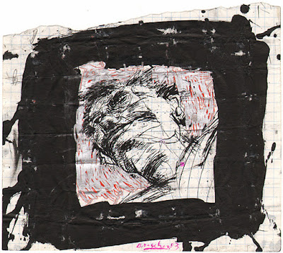
I'm not sure which review the above piece accompanied, but I was taken with the imagery of the people within the large head, searching for something. The wonderfully eclectic ink hatching and textures, combined with the roughness of the border, with the scratching through of the paper, adds a lot of visual movement to the edges.
This self-promotional leave-behind features the uses of masks, which I often love seeing in artwork. In this case, the textures on the masks and figures, combined with the odd near-triangular shape of the people, gives movement to an illustration that might otherwise appear static. That phone number no longer belongs to Henrik, so call at your own risk! 🙂
The next two pieces came from the Patrick J. Eddington estate. Eddington
specialized in works featuring cats, and intended on publishing a book
featuring the work from his collection. The book never came to
fruition, but the collection had wonderful examples by many contemporary
artists, including Al Hirschfeld, Robert Crumb, and, of course, Henrik.
The Cats of Kilkenny is derived from the Irish story about these cats who are such tenacious fighters that they fought and they fought until there was nothing left of each other. This drawing has so much texture and movement to it, and I love the way that Henrik incorporated the tale of the one cat into the title of the piece. The text fits so perfectly with the illustration. 1994.
This is a decidedly oddball piece that of course speaks to me. It is likely a "sketch page", with a wonderful use of those terrific textures, odd figures, and forms within forms. The piece is from 1983, though was gifted to Eddington in 1986. Wonderful, wonderful work.
Henrik recently returned from an extended stay in China, and brought back a treasure trove of originals that he has been, and still does offer for sale. If you're on Facebook, you can check them out at: Henrik Drescher Original Art for Sale
I could not resist the symbolism and use of white-on-black in this New York Times Book Review piece from 1987.
There is something about the relationships of the chairs, the seeming intuitive approach to the materials, all combined with a ton of imagery, that I find fascinating. Not to mention one of those types of figures that I fell in love with in the early 1980s.
And then there is this wonderful gato, with a tongue-like list coming out of its mouth. Henrik could not recall what publication this ran in, but it doesn't matter. Once again those textures, this time combined with color, works so beautifully. And that expression is somewhere between children's book-like and maniacal. Wonderfulness.
Finally is this wonderful drawing/painting from Henrik's 2014 book, China Days, published by Chronicle Books. The book is a visual journal recorded during the years that Henrik and his wife, Wu Wing Yee, lived in China. This particular piece of art is captioned in the book, "Busking in China is seen more as a beggar's profession than an art form." This is something about the image that I found particularly striking. That use of the flat shapes of color combined with the expressive contour lines, coupled with the green and blue textures, helps to create something somewhat uneasy. There is almost an imbalance in the work that works beautifully. It also reminds me a bit of Alan Cober's work, as Cober found ways of taking disparate parts and making them sing together, uneasily.
There is much more to Henrik Drescher's work than what I'm sharing with you here. If you click on over to his website at http://www.hdrescher.com/, you'll see a great deal more work in a variety of medium and approaches. Be sure to check out Henrik's limited edition artists books while you're there.


Comments
Post a Comment